More
Сhoose
  • Role: Senior designer
  • Period: 2017 - 2019
Some projects are easier to explain than others. Project maturity, technicity, complexity... all these aspects contribute to making the story easy or not to understand. After two years trying to launch a project from scratch, these a a few lessons learnt from the field.

With the rise of digitalisation, the amount of transactions you can do on Internet has been growing exponentially. So has been the need for trust. Online trust depends merely on two conditions: to prevent fraud, we need to prove that we are the person we pretend to be. And then we need to prove that we can meet our part in the contract (payment, delivery,...) 

From certificate chains to social rating, a lot of solutions have emerged over time in this domain. But each company, each actor, is setting up its own strategy in a separated way. As a result, we end up dealing with endless amount of passwords and accounts. Initiatives are emerging to simplify this and to build trust between services. People can for example login to many websites using their Facebook or Google account. But this is not secure, and not fair. The more we mutualise our accounts, the more we feed vast databases. And behind them, we supply machines controlling what advertising we see, what news reach us, who are our friends... Databases that can sometimes get attacked, creating gigantic data leaks and related fraud.

For two years, I worked with Brickchain, a startup that was offering a decentralised infrastructure to improve trust and security. I joined the company even before the first screen was drawn. It has been an amazing, yet challenging road. The domains we were working with, cryptography and security, can be very abstract and very technical. And our project was as open as an infrastructure can be.

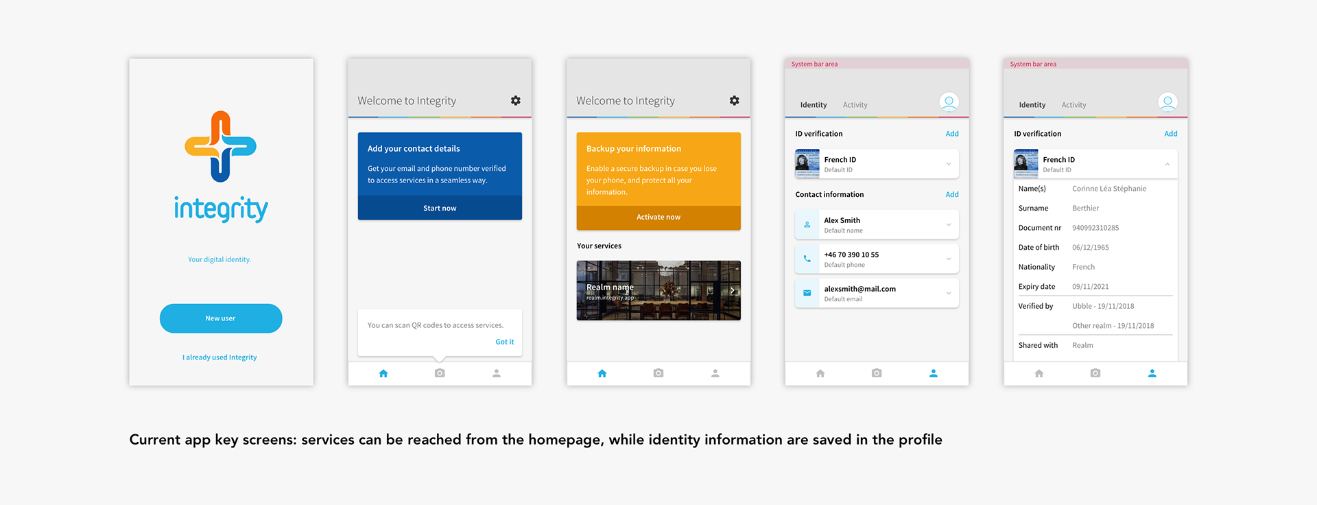
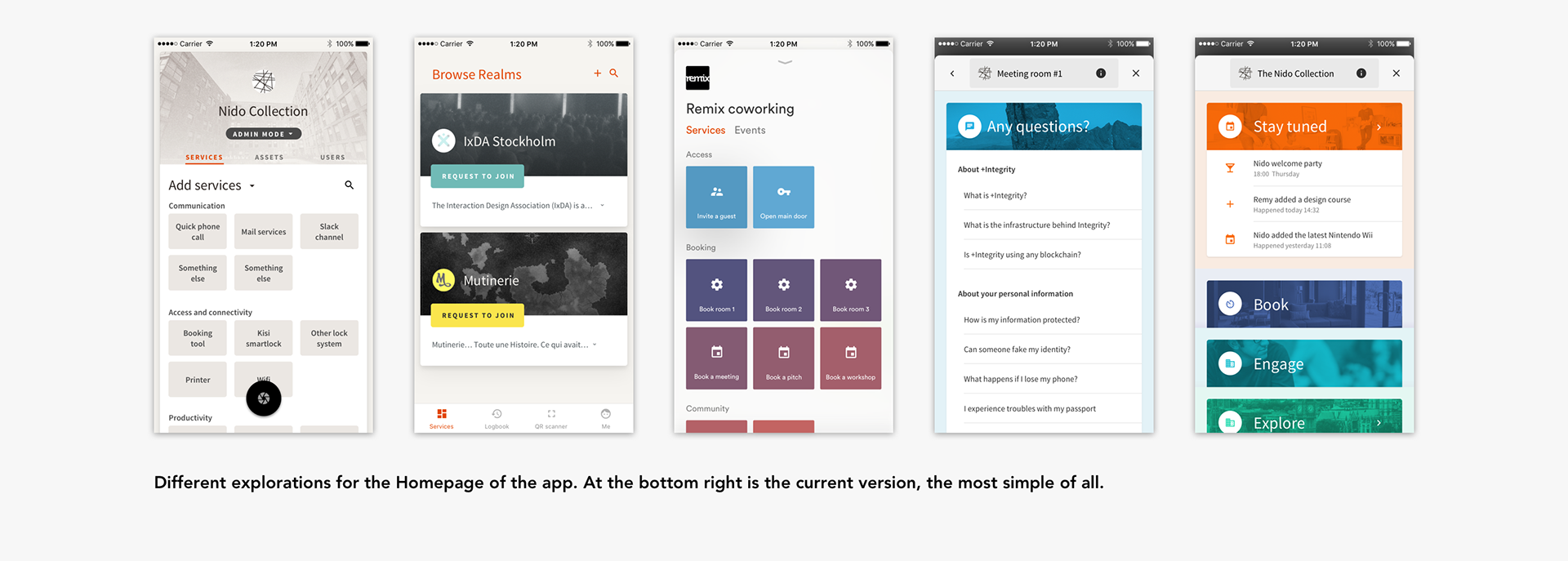
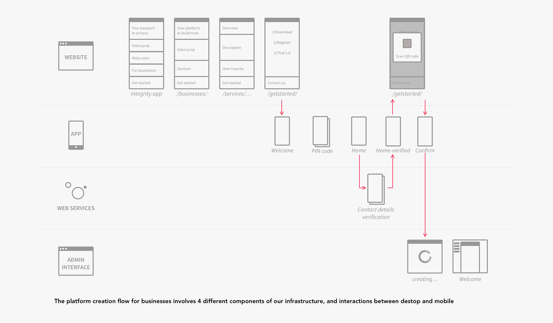
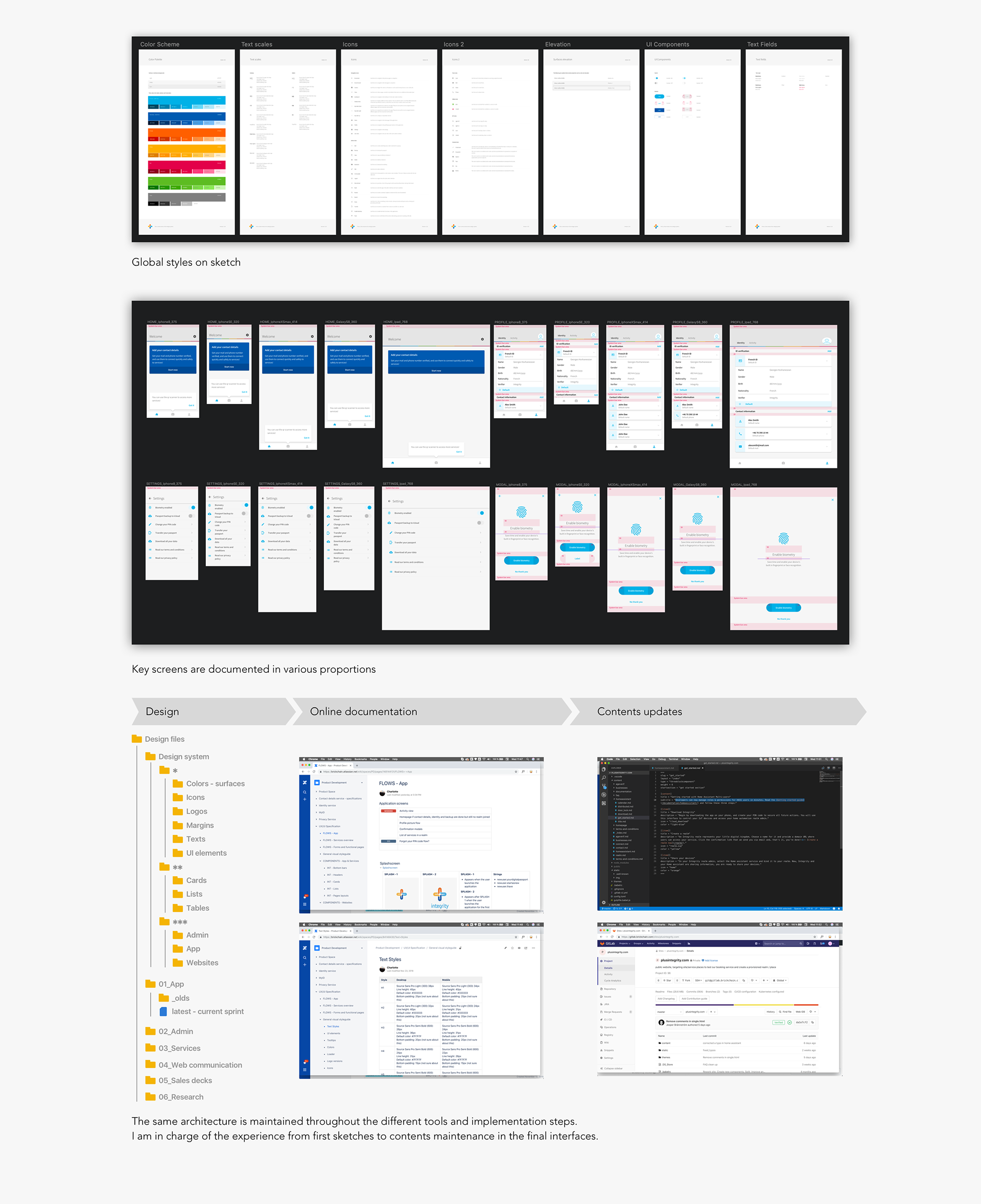
I have spent 22 months in a team of less than 10 people, being the only designer, and building Integrity, the mobile application that would be the entry door to our decentralised identity infrastructure. It enables people to keep their verified information in their phone, and only share what it necessary. In this article, I wanted to share few of my take aways about defining and designing a product from scratch.

Integrity app key screens
1 - Your target vision is not your product

Integrity is only the door to a bigger ecosystem. As such, it is an empty box until the user starts filling information and using it to connect to services. From a person to another, the possible use cases are endless. In other words, we go back and forth between the current product, and its future potential.
When i joined the team, I was coming from an agency background. As a former consultant, I thought that we would first establish a clear target vision. And then design our different features in a sort of convergence towards that vision. It did not happen.
In reality, the further we looked into the future, the more blurry the picture. Our project has been evolving based on its core, and our decisions are made based on the scale we are at.
Example – When we started designing the Homepage of the App, we were worried about the amount of information the user would have to deal with. How to filter, sort and organise the different services? Three releases later, we have realise that it will take time before the app is populated. Nowadays, we wonder how to retain a user when he has not yet connected with services, and how to describe a potential yet to come.

2 - Product design is a Rubik's cube game

One challenge in the Integrity project was to create relationships between separated interfaces. Some users navigate between the App, the admin interface, and the documentation of the project. What appeared first as an issue actually helped us twisting perspective in our reflexion.
Example – It took us time to realise that keeping our users in one interface was not helping the experience. We were trying to offer all the pedagogy and documentation possible in every interface, adapting the contents to the context. This was a lot of information, redundancies and maintenance for us. 
It was not only making our life more simple, but also making the flows more clear. Each interface had finally a clear purpose:
- The application was more focused on handling personal information.
- The admin interface was focused on the services and authorisations management.
- The websites were not solely a marketing support but an actual link between all interfaces.

3 - It is never too early to test

This may sound like an open door. But maybe I had to experience it by myself to really understand it. In the early days of the product, I did a lot of interviews and user research. The purpose was to document the need, and define our “target vision” (see my first takeaway about this). All those interviews were based on paper prototyping. I mean nicely designed screens gathered in Invision prototypes or printed with smooth transitions and animations.
But when we launched our first versions of the App, it did not look like these prototypes. The animations, nice visual effects and other dropped shadows had suddenly disappeared. They had been sacrificed to time constrains, and other priorities. And again, coming from an agency background where all our deliverables were nice and polished, I did not feel comfortable in showing around a slightly buggy and rough product.
Meet-up events saved me. I attended a few drunk user testing sessions, where startups show their product in a very informal way and gather feedback. And I realised three things:
- Some products looked even more buggy than our.
- I was getting inspirational insights every time.
- People did not seem to get bored with me showing the same product from an event to another.

4 - It is never too early to design a system

I started trying to optimise consistency in the product as well as my design files from Day 1. However, working on a product in its early stages, it was difficult to have a clear vision on the different use cases, needs and related UX components to build. In other words, I spent my first year building guidelines that I was constantly overriding.


Adopting the agile method to work with my team helped me a lot here. As our scrums were becoming more and more structured, our releases were also smaller and more frequent. This changed the scale I was working with the product. On one hand, I could become more picky about visual details and get easy fixes more quickly. On the other hand, I had to divide design changes into smaller chunks to get them fit in the release plan.
As a direct consequence, we became more stable in our design system and components library. Agile has forcing us into smoother transitions and a longer learning curve. After few full re-designs during our first year, I discovered that my components had to be smaller to perdure. Documenting less also opened to flexibility. As a result, our design system is divided by complexity levels:

  • Colours, text styles, icons and surfaces are common to all interfaces
  • 
Lists, tables, buttons, input fields and selectors change in colour depending on the context.
  • Each touchpoint has its own layout, with specific headers, footers and navigation elements.
5 - Get back to your primary ambitions

This learning is directly related to my struggle at creating a unified design system (see above). I started by reading numerous UX articles, but got mislead. I was striving defining our core values, and forcing myself to settle this decision before documenting anything. In our case, this did not work. As explain in my first takeaway, I was putting the target vision before the current product. Our project was so young and immature that our high level principles and core values never really applied. We had difficulties agreeing, when we saw a design, whether or not it met those values. Can you really say that a screen is simple? Or trustworthy?


For us, convergence started when we stopped wondering how we were gonna solve our different use cases, but rather what they were. Above all, we needed to reduce the amount of problems we were trying to answer, and simplify the situations.Today, we can say what our product will be next year. And my biggest learning has been to accept blurriness on the longer term. This does not mean that we have no direction at all! Whenever we feel lost about our future direction, we look back to the initial ambition of the project. As a team, we keep at core the humanist vision it carries, which is the very reason we started it. And our main guideline.


Note: this article was written in 2018, and Brickchain ceased their activity in 2019.